The Case for the Empty Dashboard
Why the best productivity system eventually makes itself unnecessary
Over the last decade, software has followed a predictable arc. First, we digitized our tools. Then we connected them. Then we built dashboards to oversee the connections.
The underlying belief is simple: more visibility equals more control. If you can see everything at once, you can manage everything at once. That belief gave us the modern start screen.
It looks like a cockpit. Metrics. Notifications. Unread counts. Headlines. Reminders. Everything arranged in neat panels, competing for the same square of attention. It is comprehensive. It is also exhausting.
The Cognitive Cost of Visibility
Human attention does not function like a database query. When you display forty different data points, the brain does not calmly sort them. It negotiates with each one.
Is this urgent? Do I need to respond? Should I feel behind? Can this wait? Each item asks for a micro-decision. Before you begin meaningful work, you have already spent energy deciding what deserves it.
Designing by Subtraction
The case for the empty dashboard begins with a constraint: If a piece of information does not change what I am about to do, it does not belong on the screen.
Most dashboards are built by addition. Every feature earns a tile. Every integration earns a panel. Clarity rarely survives that process.
Designing for subtraction is harder. It requires saying no to useful information in service of essential information. Sometimes the most helpful message a system can present is this: Nothing requires urgency right now.
"The highest form of a productivity tool is invisibility."
The Invisible System
The highest form of a productivity tool is invisibility. It holds structure in the background. It reminds you when necessary. It disappears when not.
You should not spend time inside your system. You should move through it. A dashboard is not the work. It is a doorway to the work.
Reclaiming the Blank Space
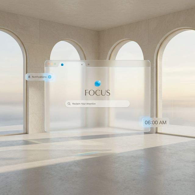
When we redesigned our start experience, we began with a blank screen. Every addition had to justify its presence. Does this orient the user? Does it reduce friction? Does it meaningfully change the next action?
Very few things passed that test. A carefully chosen “since” tracker. An essential “upcoming” date. The rest is space. Not decorative minimalism. Functional quiet. Room to think before the day begins pulling at you.
Quiet Technology
In an economy built on capturing attention, emptiness can feel radical. A blank space does not compete. It does not flash. It does not accumulate red badges.
It does something less dramatic. It gives your attention back to you. And if a productivity system is doing its job well, you will not spend much time looking at it at all.
You will be working.